Top e-commerce firms can always teach you something, whether you’re a rookie or a seasoned marketer. Every time we create one of our e-commerce growth guides, it amazes us how minor changes in design and language can make a significant difference for those firms (and for yours, too.)
We’ve included seven of the best marketing methods from our e-commerce growth guide series, ranging from generating top-of-funnel (ToFu) leads to increased customer loyalty. The best part is that you may implement these concepts in your online business even if you lack a marketing team or a large advertising budget. Modeling others who have done it is one of the finest strategies to learn how to expand your eCommerce business.
What’s the issue? It’s difficult to gain insider knowledge on how these e-commerce businesses got so successful if you don’t have the correct contacts.
You might be interested in learning more about the marketing strategy, search engine optimization, conversion rate optimization, and top customer service techniques that these eCommerce firms do to increase their sales.
Don’t be concerned. You may now go into the heads of major eCommerce companies from the comfort of your own home. How? Through in-depth case studies of successful e-commerce businesses.
That’s why we’ve done the legwork of identifying the BEST real-life examples available, along with insights into everything from their marketing strategies to their chosen e-commerce platform.
Examine what these successful e-commerce stores are doing and discover what you might apply to your own online store.
CASE STUDIES WHICH ARE A MUST-READ FOR YOU
Bosch regained flexibility and velocity with headless commerce.

Business challenge:
As Amazon drives industry trends, B2B brands like Bosch mustn’t fall behind. With Bosch Power Tools operating multiple global sites, the organization understood that its customers inherently expect the same tailored digital experience.
The business unit’s main challenge was creating multiple unique experiences at the country level while promoting and aligning holistic experiences globally.
Scaling and maintaining features and updates with numerous CMS platforms and infrastructures at the regional level was another exceedingly challenging problem.
Solution:
Historically, Bosch tackled technology on a local level to fulfill the diverse demands of users and consumers. Its strategy was to take another CMS and set up the system.
Bosch Tools used an altogether new strategy that would revolutionize the company to bridge the gap between experiences and generate efficiency inside the business.
Sunny’s Digital Transformation PM at Bosch realized that you could take each brand and talk to each country and area. Every brand manager will tell you a hundred things they want -with 90% of the time being the same. It makes no difference whatever system it originates from. In general, we all want the same characteristics all over the world!
Sunny became involved with headless trade because of this viewpoint. Headless commerce differs from standard commerce and CMS solutions by decoupling the backend and frontend.
Bosch no longer needs to create 400 unique blogs using headless. Instead, we may create a blog feature and functionality that is tailored to the location and brand.
Steinhoff uses headless architecture to drive an omnichannel strategy.
Business challenge:
Jamie Danby is Steinhoff UK’s Head of Business Transformation, and he is in charge of seeing this task through.
By comparing where Steinhoff is now to where the firm intends to be in the future, he identified certain needs that would allow for a smooth omnichannel journey:
- A personalized product experiences
- A capable team that can execute tasks on its own.
- The capacity to increase conversion rates quickly
- Rapid and agile implementation
Solution:
Jamie was able to locate the proper technology for his needs by outlining where Steinhoff UK intended to go, which turned out to be a platform designed with a headless architecture. “It wasn’t about stating, ‘We’re going headless,'” he explains, “it was about looking at the criteria and finding the proper solutions out there to assist us in achieving our goals.”
He emphasized two specific use cases:
- A Personalized Experience: Considered Buying vs. Quick Buying
A client seeks a varied purchasing experience for different items. Jamie distinguishes the most between a low and high price range.
The product determines how the client will shop, and the digital experience should facilitate that. Customizing the digital experience per product with Steinhoff’s present technology is both time-consuming and costly. But, thanks to the headless architecture, all of that is about to change.
- Augmented Reality (AR)
Jamie’s second goal is to assist clients in customizing and visualizing their purchases online.
This includes allowing site users to see how a product might appear in a certain space of their home or whether it would complement existing furnishings. This feature is already available on Bensons and Harveys’ consumer mobile applications, but it is not yet connected with the websites.
When Jamie introduces the new website, this feature will be at the top of the priority list.
Albertsons increased basket-building speed by 25% with personalization
Business challenge:
Albertsons strives to create a consistent and differentiated omnichannel consumer experience in-store and online. Albertsons has always been ahead of the eCommerce curve, having been one of the first grocery shops to begin online delivery in the 2000s.
Albertsons is looking beyond speed and convenience when it comes to the supermarket sector today. They aim to stimulate their clients to prepare for supper, provide them with different shopping options, and provide tailored, relevant material whenever possible.
Starting with the current data, Albertsons recognized the low quality of search results in terms of accuracy and relevancy. This inevitably led to the high bounce rates experienced by Albertsons. They hoped to change this by improving the client experience and boosting basket size.
Solution:
Site search was key to this transition. “We find that approximately half of our online eCommerce is related to search,” they identified an opportunity with product search and browse solutions to shorten the time it takes to construct a basket, improve basket size, and boost conversion rates.
“We witnessed enormous benefits” after switching to Bloom reach Search & Merchandising (brSM), says Shanti, “it’s more than a search box.” brSM is responsible for our whole search and browsing experience on our eCommerce site.”
Customers can also locate goods and add them to their basket considerably faster-using brSM, according to the statistics. Since deploying brSM, our basket-building speed has increased by more than 25%.
HD Supply increased revenue from search 16% with the better search experience
Business challenge:
HD Supply is now reconsidering its whole digital approach. Certain pain points indicated that the multibillion-dollar corporation was not innovating quickly enough.
Brooke, Senior Product Manager, eCommerce at HD Supply, is important in bringing processes up to speed through digital transformation. Brooke was tasked with improving the site experience, as she was in charge of everything from the homepage to category pages and to detail pages.
Brooke began by investigating the different channels and how customers engage with them. Brooke discovered from consumer behavior that purchasers desire to be able to make a transaction fast and reliably:
“They want to quickly identify the correct things, double-check that they’re selecting the proper products, order them, and get back to their day.”
It’s all about making it happen. Add to Shopping Cart button as simple as possible.” Moving ahead, a pleasant purchase experience was critical to the approach.
Brooke identified some obvious experience flaws as she dug further into the facts. “Our search was simply typeahead, crucial filters were hidden in a tabbed approach or strewn over the screen, and our category navigation was useless.”
Solution:
Recognizing that HD Supply consumers want to finish purchases quickly, Brooke explains, “We updated our site search experience with the ability to Add to Cart right from the search bar.” “We still provide typeahead to consumers,” she continues, “but we also provide them three product options.” They may now view the product image, part number, price, and Add to Cart button in the search bar.”
With these search modifications, HD Supply saw a 16 percent boost in income from search, “which was simply the algorithm and some search and merch work,” admits Brooke.
This perspective led Sunny to headless commerce. Headless commerce differentiates from traditional commerce and CMS systems by untethering the backend and frontend from each other.
Especially notable for me. Our Add to Cart rate increased by 4% from list and product detail pages. That’s significant because it indicates that customers effectively locate the things they want to buy.
HellermannTyton increased website visitors and conversion with next generation CMS

Business challenge:
HellermannTyton is the world’s top manufacturer and provider of cable management systems, with offices in 39 countries. It aims to provide a more tailored experience for its clients while internally integrating its global systems and data.
HellermannTyton wants to make important data available to customers and workers to enhance company success. Which, as you can think, was quite a struggle.
They were searching for a solution that could ensure uniform product display while also providing capabilities like search to help with sales and marketing.
Solution:
They picked Bloomreach Experience Manager (brXM), a java-based corporate CMS, because of the clear separation between content maintenance and content delivery.
HellermannTyton began developing a sophisticated data management system using brXM. This established the groundwork for HellermannTyton’s global business strategy.
They developed a robust, responsive website for prospects and consumers. The site focuses on personalization and uses relevance targeting to a group of even unknown consumers and provides different content to various personas.
HellermannTyton took personalization to the next level by providing its clients with an individual personalized section called MyHellermannTyton. HellermannTyton provides features such as favorites lists, last searched phrases, and a hardware registry as part of this service to assist consumers in identifying items as quickly as possible.
After creating “We noticed a steady growth in sessions, visits, search inquiries, and conversions after developing www.hellermanntyton.com using Bloomreach,” Alexander says, “and we quickly multiplied our material into other languages.” For example, our SEO material is created once and operates in several regions.” Alexander has also noted that content managers find brXM to be simple to use, with little training required, and consequently, they save time.
Annie Selke achieved a 34% revenue lift from intelligent merchandising
Business challenge:
What Annie Selke cares about the most as a company is making people happy by developing attractive, high-quality goods that bring joy to their client’s homes.
They are meticulous in their attention to detail. From the moment you visit their website, through the moment you make a purchase, to the moment you receive the item and open it. “From the beginning, merchandising was critical to our client experience,” reveals Monica Cleveland, CMO, Annie Selke Enterprises.
Monica emphasizes, “It’s critical to display the correct items to the customer at the right time and in the right location,” which was the secret to Annie Selke’s merchandising success. This is especially true when someone goes to the search field to input a specific product they’re looking for.
Solution:
Step 1: Fix the Search
“Customers were seeing these irrelevant results, and we had no control over it.” “Every time we changed our backend rules, a new problem would arise – it was just an awful client experience,” she recalls.
“From a customer viewpoint, it’s a significant improvement – even before you click Enter,” Monica says of the implementation of Bloomreach Search. “As soon as you start typing on our site, you get visual product suggestions based on what previous consumers looked for.”
“If you show them what they want, they will buy.” And the stats speak for themselves: in the first six months after adopting Bloomreach Search, Annie Selke witnessed a 40% boost in search income.
Step 2: Collect the Required Information
Aside from search, Monica says, “we’ve been asking our analytics team from day one – I want to know which things are selling from which category – and we’ve had zero to minimal luck.”
Prior to Bloomreach, we all conducted manual reporting to attempt to figure out how to sell the categories. We have over 400 categories, and manually merchandising all of them in a timely way was simply impossible.
For the best results, the Annie Selke enterprises combine Bloomreach technology with the experience of its merchandisers. The Bloomreach algorithm is the sole one used by the team in several areas. In the case of others, merchandisers make modifications based on Bloomreach data, which is monitored in the ‘Activities’ area.
As a result, Monica has seen a 34 percent increase in income from all merchandising efforts conducted in the first six months since implementing Bloomreach.
Grand Vision combines content and commerce for a unified CX

Business challenge:
GrandVision understands the value of having a clear vision of what lies ahead. Every day, their established brands such as Vision Express, Pearle, Eye Wish, Apollo-Optik, Synoptic, and GrandOptical help millions of clients see more clearly.
While GrandVision is best known for its 7,000+ brick-and-mortar locations, it’s clear that digital experience will play a growing role in their business – both in terms of online commerce and digital affecting physical store sales (e.g., omnichannel effect).
GrandVision researched their client journey to identify pain spots and unmet demands. They defined what was required from a central digital commerce platform to offer a unique and creative consumer experience for each brand while leveraging a common underlying tech stack and addressing those goals and pain areas.
Solution:
One key criterion stood out: the requirement for a front-end customer experience layer that is separate from the business logic layer to enable their 30+ brands across 44+ countries the opportunity to build their own identity while keeping the back-end constant for easy maintenance and growth.
GrandVision chose a mix of Bloomreach’s Digital Experience Platform, Bloomreach Experience (brX), and the Commerce tools “headless commerce” platform as the core engine of their digital channels with these important requirements in mind.
GrandVision exemplifies the sort of forward-thinking retailer that will prosper internationally by integrating online and offline customer journeys and future channels such as virtual assistants and social selling. That is entirely consistent with our post-web DNA.
Commerce tools CEO Dirk Hoerig stated. “We are overjoyed to be able to assist this vibrant firm in handling transactions in all 44 countries in which it operates using a single commerce platform.”
Boden personalizes every visitor’s experience

Business challenge:
Boden recognized that personalizing the consumer journey was critical to their long-term success. They were, however, hampered by antiquated tools, so they embarked on a multi-year transformation initiative to modernize their platforms.
The importance of site merchandising in ensuring a positive digital client experience cannot be overstated. However, the team was working with technologies that needed a lot of manual effort, making trade adjustments time demanding and sluggish to market. They searched for a solution that would allow them to spend their time more effectively and strategically as part of the digital transformation effort. They were seeking a solution that would: provide their clients with a personalized experience
Reduce the amount of time spent on manual rule-making.
Increase the team’s agility and flexibility in responding to consumer requests.
Solution:
These desires prompted Boden to investigate Bloomreach’s Search and Merchandising (brSM) solution to learn how it may aid in Boden’s success.
Boden is now able to provide a personalized experience for each of its guests thanks to Bloomreach. The AI-powered solution saves time-consuming manual effort and provides capabilities in A/B testing, slot-based merchandising, 1:1 personalization, segmentation, analytics, and more.
The impact:
Boden is now able to update the product sort order every 15 minutes, rather than only 2-3 times a week, thanks to the use of Bloomreach Search & Merchandising. Instead, then relying on guessing and intuition, make judgments based on consumer behavior. Using the A/B testing and personalization function, you can increase top-of-funnel engagement.
Torrid helps customers find what they want
Business challenge:
Torrid, renowned as the finest shopping destination in the United States, offers a diverse product range to ensure that every consumer finds the perfect fit.
The brand’s purpose is not to win customers through low prices and convenience. Instead, it aims to retain clients by providing a first-rate online experience. Torrid wants to create a comprehensive, educational experience for customers that makes them feel like part of something.
The purpose was to create appealing digital experiences for Torrid’s consumers by “offering a sophisticated search engine that provides customers refined and more specific results, allowing her to buy more effectively.”
Torrid provides such a diverse selection of goods (swimwear, shapewear, shirts, dresses, jeans, etc.) and branded items that it was difficult for the firm to provide correct search results to each visitor.
Torrid valued accuracy in comprehending what users put into the search field and altering those results based on general visitor site activity. If a product, such as a flowery Harper top, has been especially popular with Torrid consumers, it should show at the top of the page since it is more likely to sell in the future.
Solution:
Torrid discovered that the Bloomreach Search and Thematic Pages tools met all of her criteria. The AI-powered site search greatly aided Torrid’s ability to scale. Sumaira was also able to improve the search experience for clients by partnering with Salesforce Commerce Cloud.
‘With the complicated Bloomreach algorithm, not only are the search results now constant, but they’re also incredibly accurate,’ Torrid explains. ‘The amount of trust we have that we’re showing our consumer the goods she’s looking for has risen enormously.
MORE EXAMPLES OF CASE STUDIES
Envelopes.com achieved 40% more conversions by following up
Prospects leaving the page before completing their order is a regular eCommerce issue. We’ve all done it as consumers before. So Envelopes.com wanted to explore if they could “rekindle the flame” and land some purchases from hot leads by employing targeted follow-ups. These are visitors who registered an account and added an item to their shopping cart, indicating a genuine desire to buy at some point in the future.
The Envelopes.com team was positive that sending targeted follow-up emails resulted in purchases, but they weren’t sure when to send them. So, they examined email messages at two different time-lapses following cart abandonment; the first group sent the next morning at 11 a.m., and the second group 48 hours later.
The emails sent at 11 a.m. the next day had a 38.63 percent open rate, a 19.54 percent click-through rate, and a 27.66 percent conversion rate to a sale. The emails sent after 48 hours had a 38.01 percent open rate, a 24.71 percent click-through rate, and a 40.00 percent conversion rate.
Although sending similar emails the next day after cart abandonment resulted in a slightly better open rate, the most critical metric, conversion to sale, was much lower.
Take home message
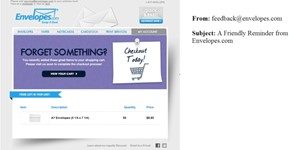
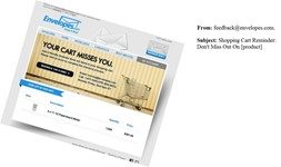
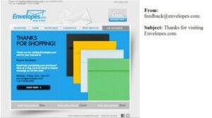
Send a follow-up email to customers who abandon their carts if you aren’t already. Though Envelopes.com discovered that 48 hours later was the best performing time, a different cadence and time lag may work better with your consumer base, so experiment with several options. If you need some inspiration for a creative message, we’ve put the identical email creative utilized by Envelopes.com here:
Budapester increased mobile conversion rates by 29% by communicating its USP more prominently
Anyone in the eCommerce industry will agree to how discouraging it may be when a significant increase in traffic does not result in an equally significant increase in revenue.
Unfortunately, it is exactly what occurred a few years ago to the German luxury clothes shop Budapester.
Surprisingly, the brand’s website had hundreds of thousands of views each month—but conversion rates were awful. The situation was exacerbated on mobile when Budapester’s conversion rate was less than half that of its desktop counterpart.
When the firm realized that something needed to be done, its first order of business was to better express its unique selling propositions, as well as other offers and policies, to its visitors. This entailed prominently presenting information about free delivery, shipping alternatives, and product availability on its individual product pages:

Along with this, Budapester changed the header of its website, especially lowering the size of the logo and inserting the aforementioned information at the very top of the page. Again, this made it much easier for visitors to quickly learn about these regulations and incentives.
Finally, the team improved the look of its shopping cart page. Based on this…
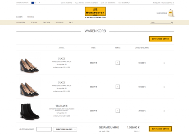
To this:
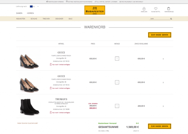
The aforementioned information is now prominently shown to the consumer once more—this time in two ways. Aside from the header update, the website now advertises the company’s free shipping offer in a green typeface that pops out at the bottom of the screen.
“Its overall conversion rate increased by 12.5%, with its mobile conversion rate going up by nearly 30%. All in all, this equated to an additional 120,000€.”
Take home message
There are three main lessons to be drawn from this:
To begin, it is critical that you express your value to prospective clients in a clear and straightforward manner. How are your visitors meant to know if you provide something valuable—say, free delivery on sales over $100—but don’t inform them about it?
On the other hand, you should avoid putting repetitive or unneeded content on your eCommerce website. This not only may be annoying to your visitors, but it also takes up actual space on your site that may be better utilized.
Finally, it’s worth noting that optimizing your site may not necessitate a new redesign. As with Budapester, a few little, apparently trivial changes might be all that your site needs to begin delivering tremendous amounts of conversions.
Edible Arrangements boosted same-day sales by 8% with one simple messaging change
Edible Arrangements faced a common marketing difficulty. They provide same-day delivery to clients (and have done so for years), but consumers were not taking advantage of the service since they were unaware of it.
They greatly improved exposure with a huge banner in an exceptionally prominent location on the homepage, right below the navigation bar, to educate users about this choice. By including a countdown timer to the deadline for same-day delivery, established a sense of urgency surrounding the offer. It was impossible to overlook or misinterpret.
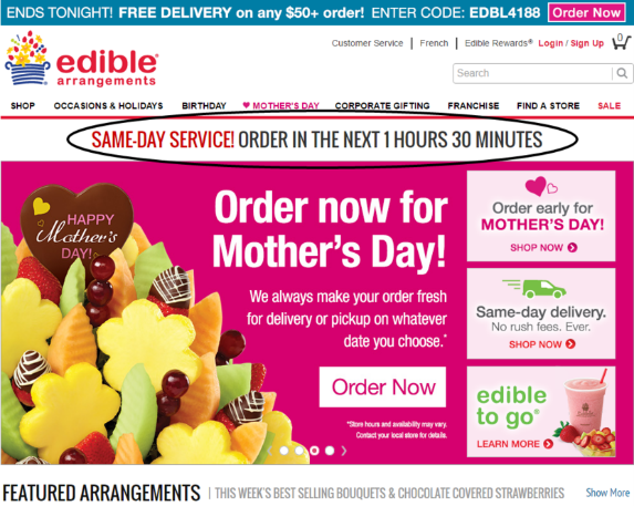
What is the end consequence of this basic countdown feature? An increase of 8% in same-day sales!
Take home message
It is not necessary to launch a new product to market anything. People may be unaware of a product or service you currently offer, so by raising exposure to your current audience, you may be able to score some easy wins. As a side aside, establishing some sense of urgency is always an excellent sales tactic. Encourage your audience to act now rather than later (or never).
Amerisleep increased checkouts by 13.9% by focusing the copy on the true benefits of its products
Amerisleep, an online mattress company, faced a difficulty similar to Budapester’s:
The company’s website was receiving a lot of traffic, but conversion rates were nowhere near where the team would have intended them to be.
Amerisleep, on the other hand, opted to take a different strategy to improve its website with the aid of Growth Rock:
Rather than adding or removing specific material, the team sought to improve the meaning of the site’s copy in a few ways.
First, the team delved further into the genuine advantages that their goods bring to their clients. In Ameri sleep’s case, this meant going beyond just offering “a good night’s sleep” and instead emphasizing how obtaining a good night’s sleep every night can really change your life.
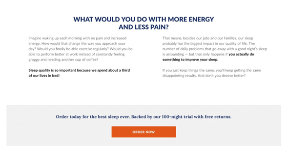
Second, the team attempted to eliminate visitor reluctance by emphasizing the significance of rapid action. Rather than describing the aforementioned benefits in a more hypothetical manner, the site’s material was revised to address the notion that every night spent tossing and turning is another night visitors would never get back.
Finally, the team clarified some unclear language comparing Amerisleep’s goods to those of its competitors.
Originally, the website boasted, “No mattress is more thoroughly developed.” The issue is that this might be construed as “No mattress is more thoroughly constructed—but many are equally as carefully built like ours.”
The revised copy stated:
“Our innovative and proprietary materials let us build one of the most comfortable mattresses ever”
Much stronger, don’t you think?
Again, these seemingly simple changes have far-reaching consequences for Amerisleep: That 13.9 percent increase in conversion rate we indicated before translated into millions of dollars in additional income over the next year.
Take home message
The main point here is to always write with your audience in mind.
This includes:
- Ensuring they understand the true value your product will bring to their lives, as well as what it will enable them to do or accomplish.
- Instilling a sense of urgency in your visitors, so they not only understand what they have to gain from using your product but also what they have to lose by not using it; and
- Double- (triple-, and quadruple-) checking your copy to ensure it means what you want it to mean—and that your visitors will interpret it correctly.
Company Folders streamlined their quote page to increase conversion by 68%
Company Folders is an established company, but their website was, to put it mildly, “clearly last year,” according to their CEO.
The key issue they wished to address was their online quotation function. Because this is a critical stage in their marketing funnel, making the procedure as simple as possible was critical to eventually drive more sales for the company.
This may appear to be a straightforward operation, but the present quotation system was quite complicated, with over 15 million product combinations. Furthermore, there was a very high proportion of prospects abandoning the form halfway through.
Intuitively, they felt that consolidating the form onto a single page would speed up the process, but after polling their greatest clients, they concluded that a redesign was required.
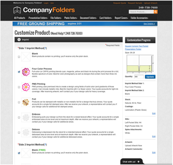
They took a time-consuming single-step procedure with several alternatives and reduced it down into a multi-step bite-size method (pictured below). This resulted in a stunning 67.68% rise in total quotes.
Take home message
Breaking down a complex system into fewer, more manageable processes can help consumers stay engaged and enhance conversion. Though more clicks are sometimes viewed as fresh possibilities to lose clients, our experience with Company Folders shows us that condensing to shorter phased forms is the way to go right now.
A furniture retailer increased its AOV by 4.6% in 41 days by cross-selling a small-ticket item on its shopping cart page
(Note: Because the firm did not want to be identified for this study, we will, of course, respect their privacy.)
Perhaps the only thing better than converting potential consumers in the first place is persuading them to add even more products to their cart before converting.
Our anonymous furniture manufacturer is aware of this, which is why they planned to cross-sell a conditioning kit to clients who purchased leather furniture from their online store.
While sales of the company’s “primary” products (furniture) were rather good, sales of these smaller supplemental items were not. The biggest issue was that most buyers had no idea the firm supplied the conditioning kit in the first place. Essentially, they would only be exposed to the product if they actively searched for it on the company’s website.
(It’s also worth noting that the item being cross-sold costs just approximately 6% of the company’s average order value while providing a tonne of value to the primary product.) In other words, it should have been a no-brainer to make the extra purchase.)
Recognizing the need to improve their promotion of such smaller-ticket products, the firm opted to integrate a call-to-action right within the shopping cart page when customers added a suitable big-ticket item to their cart.
As a result, the page changed to appear like this:
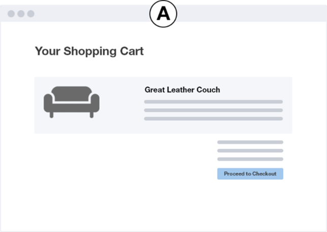
…to look like this:
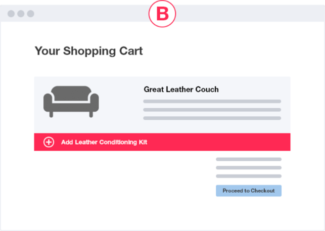
Customers could then add the additional item to their basket with a single click (by clicking the + symbol), and they could also view the product page for the smaller item by clicking anywhere else inside the pink bar.
The outcomes were nothing short of spectacular: According to Growth Rock statistics, the average order value of the firm climbed by $55 (4.6 percent) in only 41 days. This translates to an extra $180,000 in monthly earnings!
Take home message
The first point is that successfully cross-selling relevant things that add value to your higher-ticket items (and hence add value to your customer experience) can have a significant influence on your overall sales.
However, merely providing such extra items is insufficient. You should also advertise these things as a complement to the more precious and pricey items you provide.
(For example, if a buyer is looking for leather furniture, it’s more probable that they’ll buy leather cleaner from a furniture eCommerce site.) As a result, you should concentrate your efforts on advertising the product exclusively to these people.)
Along with this, you must promote your cross-sell offer at precisely the appropriate time to entice your clients to bite. The firm did so in this case because visitors exhibited a high likelihood of making a significant purchase — a good opportunity to offer more value to their overall experience with the brand.
Taloon.com got caught up in the social proof movement, including “Like” and “Share” buttons on their product sites. They did, however, discover exceptionally low conversion rates on pages featuring social sharing icons.
They constructed two copies of the same website, one with and one without the social share icons, to see what was going on.
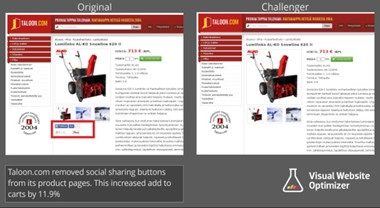
They reasoned that by decluttering the page, users would be able to focus on the task at hand – checking out.
What were the outcomes?
“Pages without social share icons saw an improved “add to cart” click-through by 12%”
Take home message
Simply because everyone else is doing it does not make it correct. Put yourself in your customer’s shoes and keep them focused on the key job you want them to perform. Unnecessary steps should be removed from sites to focus on the sale.
Gwynnie Bee saw 5.85% CTR from optimized non-scripted influencer campaigns on YouTube
You’re certainly aware of how powerful influencer marketing can be in spreading brand awareness and social proof, as well as improving engagement among members of your target demographic.
Gwynnie Bee, a rental clothes e-retailer, noticed the same thing a few years ago. While the team has had some success with other marketing methods (such as Facebook Ads), they recognized they could be producing a lot more revenue than they were.
As a result, the organization teamed with Reelio to get things started.
Gwynnie Bee began sifting through YouTube’s vast database of influencers, working with Reelio, in search of people that corresponded with the apparel company’s target demographic.
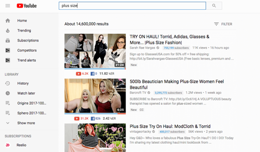
The first task for the team was to compile a list of probable candidates who matched the “surface-level” criteria of their target market. This entailed locating female influencers who were 18 or older and often wore clothes sizes 10-32.
This is when Gwynnie Bee deviated from the “normal” path that most companies pursue. Rather than focusing just on those who frequently collaborated with other fashion brands, GB also analyzed those whose target demographic intersected with their own. This entailed looking at influencers that provide material on peripheral areas like lifestyle, accessories, food, and so on.
The team then created rules for their selected influencers, allowing them to generate content that is real and unscripted while still aligning with Gwynnie Bee’s broader marketing aims. GB’s influencers developed a virtual “closet” on the brand’s website to exhibit the exact goods they loved the most, in addition to providing content for the influencer’s channel.
Gwynnie Bee’s influencer efforts yielded…well…dang good results. While the average click-through rate for all influencer efforts is about 2%, GB’s campaigns had a CTR of 5.85 percent — over three times the norm.
Take home message
If you’re just getting started with influencer marketing, the most important thing to look for is content producers that have an engaged following full of customers who are similar to your target market in some manner. They don’t have to overlap completely, but you want to make sure that the people who view your items have true respect for and interest in your brand.
In terms of content production, you’ll want to give your influencers practically unlimited freedom to maintain authenticity. This will convey to your influencer’s audience that the influencer truly utilizes your items and isn’t just endorsing them because they’re paid to do so.
Finally, you may want to invite your influencers to generate content for your channels as well as their own. Again, this will demonstrate to their audience that they are true brand superfans that actively connect with all your organization has to offer.
Express Watches debated price vs authenticity… With shocking results!
This is a common issue for internet retailers: do you promote the lowest prices or the most authentic products?
On their website, the Express Watches team was contemplating whether to express a ‘lowest price promise’ or a sign of authenticity. They experimented with versions of each, each expressing a distinct tale about the clientele: bargain hunters vs enthusiasts. The outcomes were somewhat shocking.

Express Watches witnessed a 107 percent boost in online sales after affixing a badge of authenticity to their website. Simply by adding a little badge of legitimacy, you may make a significant difference above the price-based message.
Take home message
You may believe you know what your audience wants but experimenting with different value propositions may surprise you.
eCommerce companies saw a 27% spike in sales by increasing marketing spend during the 2014 World Cup
The 2014 World Cup was not just the most-watched athletic event on television in the twenty-first century; it was also the most-watched event of any sort.
Such a large audience created some significant prospects for eCommerce enterprises all around the world. Of course, this increased rivalry for companies in categories such as athletic goods, clothes, and collectibles.
According to SEMRush, the businesses that came out on top were those who:
- Increased their presence on the proper platforms (particularly, social media),
- Adjusted their ad text to target soccer fans from certain countries (e.g., whose teams were making a run for the World Cup)
- Created relevant and valuable offerings in response to time constraints (e.g., fast, and free shipping to ensure orders were received before the World Cup had ended)
The opportunistic actions resulted in MASSIVE income for eCommerce businesses. In Brazil, eCommerce transactions increased by $16.6 BILLION, or 27% over the national average. Following Germany’s victory, German-based eCommerce activity soared by a stunning 75%!
Take home message
First and foremost – and this applies to any business, online or offline – you must notice an opportunity when it presents itself and strike while the iron is hot.
It’s worth noting that once the national team was ousted from the competition, Brazilian-based eCommerce activity plummeted by 17 percent.
To spot these possibilities, keep an eye out for future events — whether it a sports tournament, music festival, fashion show, etc. – that are related to your brand’s products in some manner.
The idea is to “piggyback” on the enthusiasm generated by these events and promote your products to individuals who are attending or involved in some manner with the event.
There are two primary approaches to this:
You could just do what the businesses described above did and increase your marketing efforts during the duration of the event, or you could reach out to the event’s host to see if they’d be interested in collaborating in some manner. This may involve sponsoring the event (rather than increasing your ad budget) or even setting up a pop-up store at the event itself.
Underwater Audio removed charts to bump sales by 41%
Underwater Audio was experiencing an issue with visitors who were during their sales funnel, investigating certain goods but then abandoning the site at the comparison page. When they discovered the leak, they resolved to find out what was causing it.
Here are the previous and subsequent versions of the page. They don’t appear to be that different at first glance, but the devil is in the details.
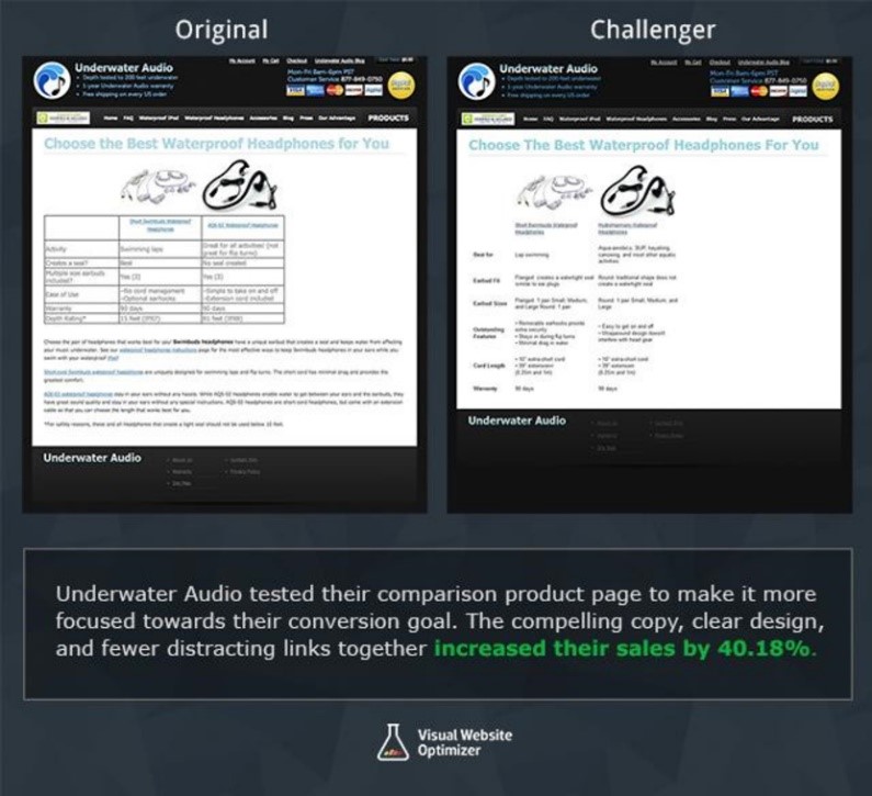
The original was a little more crowded, with table formatting interfering with the flow of information. To determine the source of the problem, they updated the comparison page to be simpler and more streamlined.
As their CEO put it:
“The (rather) unattractive table had information in terse phrases organized in no particular fashion (activity, seal, size, features, warranty, depth). The paragraphs continued below the fold and essentially repeated the table, with only a few unique additions hidden in the text. In short, it was not the most engaging page!”
The data tables were removed, the language was simplified, and everything was moved above the fold in the new edition.
As a result, The revamped website resulted in a 40.81 percent increase in online sales.
Take home message
“The simplest answer is generally the best,” according to Occam’s Razor, and the simplified flow worked brilliantly for Underwater Audio. Find the pages in your funnel where visitors are leaving and explore how you can simplify them to better concentrate your customers.
Kettlebell Kings’ Instagram has directly led to “hundreds of thousands” of dollars in revenue by creating a content “guideline” for their user-generated-content posts
In yet another example of “something isn’t working as well as we expected, let’s try something different,” the owners of fitness equipment firm Kettlebell Kings turned to a more organic strategy after discovering that their Google Ads were costing the company far too much money.
Instagram is the primary focus of the team.
Their endeavor began simply enough, with the creation of instructional content aimed at teaching their target audience how to make the most of their training sessions.
As interaction increased, the team saw that its consumers had begun making their own material highlighting Kettlebell Kings’ goods, prompting the firm to begin utilizing this UGC.
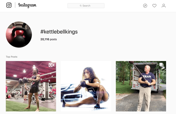
In addition to the more audience-controlled material seen in the image above (that is, content using Kettlebell King’s goods but not directly published on the brand’s Instagram profile), the team started re-posting select UGC on their own page. The Kettlebell Kings team devised a list of requirements for such material to fulfill in order to be included, similar to how Gwynnie Bee did with its influencers but also allowed for some creative flexibility on the side of the consumer.
While the material produced (by both the team and their consumers) increased brand visibility and engagement, the team went a step further by including calls to action in many of their postings. Many postings that promoted specific items, for example, were made shoppable, while others provided a “swipe up” option to learn more, download supplementary information, or sign up for the company’s mailing list.
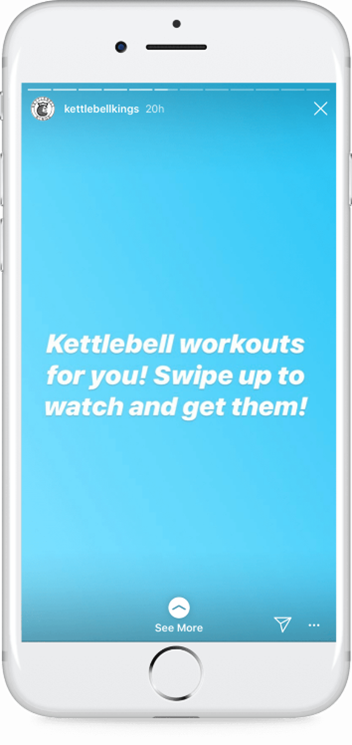
While the brand’s Instagram presence has directly resulted in “hundreds of thousands” of dollars in revenue, Buffer claims that Kettlebell King’s social media endeavors have played a significant impact in the company’s growth into the seven-figure range.
Take home message
There are several lessons to be learned here:
Social media success necessitates a very deliberate approach to content generation and presentation. It all comes down to presenting your products in a way that highlights their genuine worth to your consumers, as well as how your customers can receive this value from your items in the first place.
While user-generated content (UGC) is usually welcomed, this does not imply that you must highlight every piece of UGC that comes your way. Again, you only want to offer material that portrays your product in the best light possible and gives some form of value to your audience.
Finally, while using content to increase engagement is important, your primary objective should be to convince your audience to do “the next step.” Whether it’s signing up for your newsletter, contacting your firm for additional information, or making an initial purchase, make sure your content encourages your potential consumers to interact with your brand further.
Paperstone took out their competition with a simple comparison table
Paperstone is a tiny paper firm that competes with big-name retailers like Staples and Viking. With most consumers gravitating toward the brands, they are most familiar with, Paperstone wanted to find a method to utilize their competitive advantage: cheaper costs.
Instead of paying top cash to fight for advertising attention, they simply placed a comparison table on their homepage that compared their price to that of their competitors.
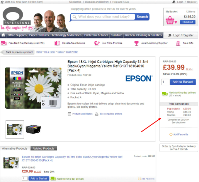
This straightforward table improved online sales by 10.67%! Consider how much money it would imply for your company if you didn’t run any fresh promotions or campaigns.
Take home message
Analyze your competitors and determine your own strengths. Then, contrast these with your competitors’ deficiencies to make your company appear to be the obvious option when contrasted.
MVMT generated $90M in revenue in five years by “hacking” Facebook ads
MVMT had its work cut out for them in terms of building exposure and brand awareness as a brand-new business aiming to disrupt the relatively saturated luxury watch industry. As a result, the team resorted to Facebook advertising.
In terms of content creation, MVMT used a similar strategy as Kettlebell Kings: they worked under well-established parameters to guarantee consistency, developed a diversity of material, and included obvious CTAs inside each piece.
They didn’t, however, start developing entirely new material for these commercials right once. Rather, they looked at the material that had previously achieved organic success and directed ad dollars toward promoting those specific items.
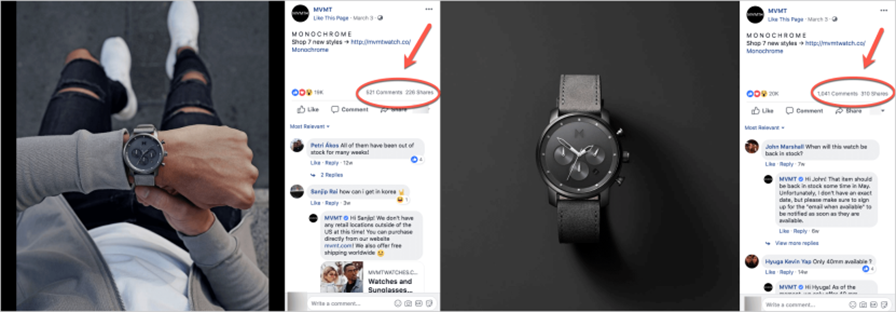
(Take a guess which one MVMT decided to promote…)
Though they had obviously worked out a means to assure their advertising would create even more interaction (based on past engagement data), they went a step further by A/B testing different components of their ad content, from the pictures utilized to the ad wording.
Take home message
While there are many lessons to be learned from MVMT’s strategy, the most important thing to remember is that generating advertisements on any platform should never be a gamble.
MVMT could easily have generated fresh ad content targeting its potential clients and hoped for the best. Instead, they used previously obtained data to influence their strategy to generate Facebook Ads that targeted certain audience segments.
ECCO Shoes decreased customer acquisition costs by 14% ditching Google Ads (and switching to Shopping Ads)
While establishing sponsored advertisements costs more than pursuing the organic path, certain paid choices may wind up being more (or less) expensive than others.
That is why ECCO Shoes opted to work with Digital Gearbox while transitioning from text-based Google Ads to image-based Google Shopping Ads.
The initial phase in the process was determining which exact items to target with their ad budget, as well as the audience(s) to target. While the team would eventually create ads for all of the brand’s items, the first focus was on placing top-sellers in front of the appropriate potential buyers.
The team then created and improved their product feed to ensure that all relevant information was included in their adverts and product pages. This material includes product specifications, photos, and any supplementary information (such as shipping charges and return policies).
After the ad campaigns were online, the team went into “experimental mode,” assessing the success of each ad and ad campaign and making continual tweaks as needed. This included not just constant refining of the product feed and ad content, but also modifying bidding and targeting definitions.
Overall, ECCO’s Google Shopping campaigns proved to be far more cost-effective than text-based advertisements, with the company’s cost of client acquisition dropping by an incredible 14%.
Take home message
The important takeaway here is that eCommerce businesses selling physical goods should strongly consider advertising on Google Shopping.
Google Shopping allows you to display far more information in a single location than most other kinds of advertising (especially text-based Google Ads). Aside from the ability to include product specifications and service-related information, the introduction of product pictures alone is enough for Shopping advertising to be deemed more successful than their text-based counterpart.
Away generated $125M by offering more than just a product
As we’ve previously written, Away is primarily the result of co-founder Jen Rubio’s disappointing experience with an expensive and not-so-durable piece of baggage.
While it would have been simple for her and partner Steph Korey to simply create a more durable and inexpensive alternative product to build their new firm on, they knew that this would not be enough to get their foot in the door in an already crowded industry.
Instead, they positioned Away as a brand focused on all things travel, rather than simply luggage. Essentially, their rationale boils down to the notion that baggage is a means to a goal rather than an end.
According to Rubio,
“Even before we were like ‘let’s choose the luggage,’ we were talking about editorial content and all we can do in the travel space. We see the long-term potential for Away to be much, much more than just selling luggage.”
This attitude resulted in a slew of content-related possibilities for the Away team. Instead of making material about baggage (which, let’s be honest, probably wouldn’t be all that interesting), they made blog entries, podcasts, and even a physical magazine on the lifestyle behind luggage and travel.
This allowed the firm to differentiate itself in a competitive industry and deliver value to its target customer in a way that no other baggage brand does. This, in turn, resulted in huge engagement—as well as massive growth for the organization.
Take home message
The takeaway lesson here is like what we discussed before when addressing Amerisleep’s adjustment in copywriting strategies:
It’s not so much what your product is as it is what it enables your consumers to accomplish that makes them value your brand.
Rubio and Korey ran with this concept, generating a range of material to assist their audience gain greater value out of their travel experiences across the board. It is more essential to them to promote the lifestyle that their product is a part of than it is to market the product itself.
Do you want your target market to buy your products? Without a doubt. However, as Away demonstrates, this can be done in such a manner that your promotional materials genuinely add value to your audience rather than coming across as “salesy.”
Bavarian Clockworks reached $1m in sales by becoming a content marketing machine
If you were taken aback by the headline, brace yourself for another shocker:
CanIRank’s services assisted the team at Bavarian Clockworks in reaching this milestone as a brand-new firm with virtually no initial following and a very restricted marketing budget.
First and foremost, the team needed to provide high-quality, meaningful material for its target audience. While they concentrated on instructional and instructive material on issues such as clock maintenance and repair, they also developed content on more peripheral themes such as German culture and European tourism.
With a limited marketing budget, they attempted to promote their content and brand through organic means, such as guest posting and conducting interviews for publication on similar sites. This allowed the business to obtain much-needed exposure on well-established websites with an engaged and relevant audience.
Technical, on-site SEO provided the final piece of the jigsaw. This included streamlining the site’s content’s organizational structure, building interlinks between blog entries, and improving site loading time.

The results speak for themselves: Bavarian Clockworks reached the seven-figure threshold just three years after its humble beginnings.
Take home message
Perhaps the most important takeaway from Bavarian Clockworks’ success story is that building a large audience organically is still achievable.
While it’s not easy—and it certainly won’t happen overnight—start-ups on a tight budget may want to explore focusing on organic growth before venturing into the world of paid advertising. Not only is it less expensive, but it also helps you to connect with more established firms, which may help you expand in the future.
As a result, organically increasing an audience isn’t a matter of “if you build it, they will come.” To obtain traction, you’ll need to put in some effort.
As the team at Bavarian Clockworks demonstrated, this entails:
- Developing fascinating, engaging, and evergreen material that your target audience will find extremely helpful; and
- Collaborating with established firms and organizations to help market your content to relevant audiences.
- Give your new audience a variety of ways to interact with your brand.
Frank Body hit $20M in annual sales by building a community of loyal and engaged followers
We’ve already discussed Frank Body’s sudden climb to success, and with good cause.
After all, the beauty market is already oversaturated. So it’s insane to imagine that a novice to the specialty can generate $20 million in yearly income in less than four years.
While the brand has done a number of things to make this happen (as we discuss in our full-length case study), it’s worth noting that all of their efforts revolve around one main premise: creating a community of individuals who feel free to let their guard down, have some fun, and just be themselves.
Even their influencers join in on the fun:
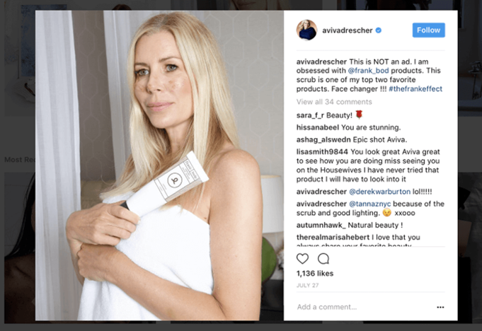
This may not seem like a huge concern; after all, many businesses currently rely on the “be yourself” mantra.
But keep in mind that Frank Body is a beauty shop. The premise underlying most firms’ marketing campaigns in that area is “use our product to appear like a Hollywood star instead of plain ol’ you.”
Frank Body is all about giving its clients the freedom to appear the way they want to look, rather than how they believe they’re “supposed” to look.
This core viewpoint has helped the brand to amass a fan base of over 600,000 individuals and reach far into the seven-figure range in just four years.
Take home message
The major takeaway from Frank Body’s strategy is to thoroughly understand who your target clients are before building your brand around them.
While this isn’t exactly a well-held secret, the fact is that most businesses believe they’re marketing to their target demographic when, in reality, they’re selling to a caricature of them.
In many situations, this is because brands simply follow in the footsteps of others in their area. While there’s nothing wrong with doing so if it fits your company, there are instances when defying the trend and going your own way is preferable.
For Frank Body, this means creating a brand centered on a community of individuals who use beauty products to enhance rather than conceal their genuine selves. While there’s no way to know for sure, it’s reasonable to say the firm wouldn’t have achieved the same level of success if it had taken the normal marketing approach that most beauty companies do.
While this isn’t exactly a well-held secret, the reality is that most businesses believe they’re marketing to their target demographic when, in fact, they’re selling to a caricature of them.
In many situations, this is because brands simply follow in the footsteps of others in their area. While there’s nothing wrong with doing so if it fits your company, there are instances when defying the trend and going your own way is preferable.
For Frank Body, this means creating a brand centered on a community of individuals who use beauty products to enhance rather than conceal their genuine selves. While there’s no way to know for sure, it’s reasonable to say the firm wouldn’t have achieved the same level of success if it had taken the normal marketing approach that most beauty companies do.
Society Socks improved survey response rate by 200% by delivering highly-relevant, easy-to-complete surveys via email
We’ve already highlighted how important it is to engage with your audience in order to obtain feedback and enhance your products and services.
However, there is no assurance that your consumers will take the initiative to submit this feedback in the first place. Even if you aggressively seek out them, the chances of them not replying are larger than the possibilities of them answering.
Knowing this, the Society Socks team set out to create a series of user-friendly surveys aimed at customers at various points of the sales funnel and buyer’s journey. Their objective was to guarantee that each respondent received a survey that was completely relevant to their interactions with the business, as well as that each survey was extremely simple to complete.
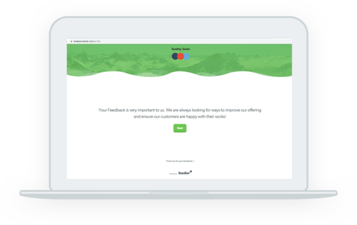
As co-founder Filip Pejic explains:
“Our current campaigns are set up at various stages including Post-Purchase, Mid Subscription and at Cancellation. We’ve integrated the solution into our email system to send automated flows depending on our customers’ stage in the buying process. This allows us to gain a ton of feedback at every point in a customer’s journey and control the number of surveys they receive.”
Society Socks also investigated the more practical issues of survey distribution, such as delivery method and schedule. This guaranteed that their target demographic received the surveys via the most appropriate channel (in this example, email) and at a time when they were most likely to reply.
Take home message
Of course, the most apparent point here is that you should learn everything you can about your clients’ expectations and experiences with your business.
According to Feedier, this entails defining or determining:
- Your different consumer personas and segments
- The characteristics of your goods (and overall service) that each persona appreciates the most
- The aspects of your products (and overall service) that each persona believes might be improved
As previously said, gathering this information (and more) from your audience will help you to make enhancements to your goods and services that are meaningful to the people who keep your company running.
Taking a step back, it’s worth noting that all of your customer-facing material should be given in such a way that your audience’s potential for interaction is maximized. This entails understanding when, where, and how to effectively contact your clients for a number of reasons so that your information does not fall on deaf ears.
SumoJerky – The Results Of The 24-Hour Business Challenge
Noah Kagan is well-known for founding many businesses and developing them all to seven and eight-figure revenue levels (including the budgeting start-up Mint.com).
Noah asked his followers which business he should start as part of a 24-Hour Business challenge to prove to everyone that they can start a business today.
What was the ultimate result? A subscription service for beef jerky that produced more than $1,000 in 24 hours.
What He Did To Succeed
Noah earned a total of $3,030 in 24 hours. How?
He did the following:
- Created a baseline budget from which he could work backward to determine how much he needed to sell to make $1000.
- Created a customer avatar to help him decide who to target.
- Began reaching out to folks he believed matched the customer avatar Bam!
He not only completed the assignment, but he also outperformed it (not after downing 4 cups of coffee though.)
Key Takeaway
To figure out who your target audience is, create a customer avatar. It’s amazing how many companies don’t know who their ideal consumer is.
Determine who is already purchasing your product or service and then reach out to more people who are like them. This is at the heart of Noah’s company model, and it is what has made him such a famous success story.
How Two Friends Turned Up The Heat And Sold $170K Worth Of Spicy Honey in 10 Months

Honey? Yes!
Chipotle peppers? Yes!
Together? What, exactly?
Don’t worry if you’re perplexed. Spicy honey is the creation of Mixed Made, a firm that creates delectable goods by combining unexpected ingredients.
Bees Knees Hot Honey, their debut product, blends raw honey with a specific mixture of chili peppers to produce a balance of sweet mellowness and spicy intensity.
(Yum… Now I’m craving some!)
What He Did To Succeed
Their first $1,000 was earned by contacting personal connections and posting on their own Facebook accounts.
They then compiled a list of possible press targets and chased them aggressively.
This worked quite well.
A few minor mentions on lesser sites such as Huckberry eventually led to stories on Uncrate, The Kitchn, CNBC, the Today Show, Bon Appetite, Esquire, and Vanity Fair.
What’s the result?
Their business skyrocketed because of the news publicity, and they became the ultimate success story.
Key Takeaway
Everyone wants to be noticed in national media, but the press starts with the little folks.
Ryan Holiday, the media genius, describes the notion of “trading up the chain” in Trust Me, I’m Lying, where larger newspapers frequently absorb content from smaller publications.
Begin with getting featured on lesser blogs and magazines, then “trade up the chain” to larger exposure in national media. This marketing tactic has a tenfold return on investment.
How Opena Case Hit 189% Of Their $15,000 Kickstarter Target And Built A Million Dollar Business
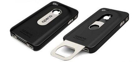
Beautiful iPhone covers abound, but what about genuinely helpful and functional iPhone cases…?
That is unusual. Introduce yourself to Opena. Opena is an iPhone cover featuring a bottle opener that slides out.
If you’ve ever struggled to find a bottle opener at a party, or are worried if your teeth were powerful enough to bust open that bottle of Heineken… Opena is the answer.
What He Did To Succeed
In June 2011, Opena debuted on Kickstarter and successfully raised $28,303 (surpassing their initial $15,000 goal).
How did they manage it?
Before launching the campaign, they developed a community of early adopters. When they first began the campaign, they rewarded early supporters with early bird goodies, and those early backers eagerly spread the word for them.
The early bird supporters were all sold out within half an hour of going online.
Key Takeaway
The point I want to make here has nothing to do with Opena’s fantastic client acquisition strategies. It does, however, have anything to do with the company’s creator, Chris Peters.
Look at his resume:
- After graduating from high school, I pursued a career in industrial design.
- Worked for a big corporation that specialized in medical machines for four years. He worked in industrial design, prototyping, and visual interfaces before moving on to other design consultancies.
- Took a year off from work to wakeboard.
- Worked for a much smaller design firm, which gave him a taste of what it’s like to operate a tiny business.
- Sold software for a year in order to learn how to sell.
- For three years, he ran his own design firm.
This suggests he had at least a decade of experience prior to establishing the firm. This also implies that he has extensive knowledge – both in identifying a problem worth fixing and in formulating a solution to remedy the problem.
Here’s an example:
The most significant business issue we encounter is that most people go into entrepreneurship without realizing that many successful entrepreneurs have built up strong subject expertise in their professions prior to beginning a firm. This makes identifying your strengths and shortcomings as an entrepreneur challenging, which is a necessary skill when starting a firm.
The Great Build Project
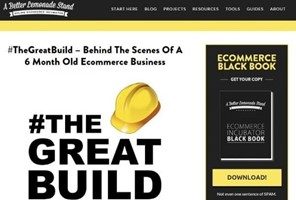
Richard Lazazzera was a member of Shopify’s Growth Team, where he assisted in growing the platform from 60,000 to 200,000 merchants. His site, A Better Lemonade Stand, gives thorough tips on how to develop and expand eCommerce companies.
#TheGreatBuild was a project he embarked on in order to motivate people to establish their own eCommerce sites. He created an eCommerce firm, Finch Goods Co., and documented the entire process on #TheGreatBuild (14 chapters lengthy!).
What He Did To Succeed
Richard suppressed his sales data (so we don’t know how much he actually made), but he did produce a case study with an exceptionally thorough step-by-step guidance on how to establish, brand, and manage your own eCommerce site.
Richard views these six factors to be critical to your eCommerce store’s business plan, and he addressed them by launching many apps:
- Checkout Upselling
- Email Capture/Newsletter Subscription
- Cart Abandonment Emails
- Recommendations (Download ReferralCandy for your Shopify store here.)
- Offer of Exit Intent
- Retargeting
Key Takeaway
The six aspects listed by Richard in his piece are wonderful. In their zeal to develop their business and sell rapidly, eCommerce entrepreneurs frequently overlook key flaws, as Richard has graciously pointed out here.
Repair those flaws, and your sales should skyrocket.
BONUS: How to Setup a Referral Program For Your Shopify Store
Social Media Marketing: How A Small E-Commerce Site Attracted 293,000 Facebook Fans

Diamond Candles is a firm that sells fragrant, soy-based candles with a bottom ring. As a consequence of the thrill of potentially winning the reward, their consumers have spread word of mouth about them.
Instead of paying internet advertisements to drive sales to their firm, their primary marketing approach has been to rely on referrals and social media.
What He Did To Succeed
The secret to their success has been user-generated content from their consumer base.
These photographs increased the company’s Facebook Fan Page to 469,661 fans while also increasing the product page conversion rate by 13% without spending a single penny on advertising.
(Wow!)
Knowing that more customer-contributed images made them more successful, they developed an atmosphere in which their consumers were encouraged to share more photos.
What they did was as follows:
- A call-to-action on the candle encourages buyers to snap a photo with the ring and share it on social media, exposing their brand to even more prospective customers (for free)
- Giveaways that encourage consumers to produce and share photographs for a chance to win free items, establishing customer loyalty.
- Sharing all photos gathered on social media, creating the idea that sharing Diamond Candle-related photos are commonplace.
Key Takeaway
Customers are your best brand ambassadors. Find a strategy to get them to spread the news about you (or use ReferralCandy). This not only broadens your reach to new consumers, but it also enhances client loyalty.
How To Create a $4,000 Per Month Muse In 5 Days

It’s Noah once more! (I told you he was well-known.)
In this case study, Noah describes how he assisted Daniel Bliss, a postal worker, in turning his passion into a legitimate eCommerce firm that generates $4,000 per month. What is the goal? Assist Daniel in quitting his day job.
Daniel began his company by resolving his personal issue: neck discomfort when belaying.
Daniel had already found a manufacturer and set up his own website to market his shades before meeting Noah. He, too, was off to a strong start, having sold 12 pairs of sunglasses to members of his climbing club.
Alright!
But here’s the best part: he HIT his goal after meeting Noah.
How?
What He Did To Succeed
Noah taught him the same thing he taught his SumoJerky company (described above):
- Reverse-engineer the number of sales required
- Experiment with various strategies to make it work
The goal was to assist Daniel in determining which marketing approaches work… and then double down on them. Daniel and Noah attempted at least ten different techniques in only five days and discovered his most effective channel. Therefore, Daniel received a message from a prominent online retailer, who placed a $4,200 order!
Boom!
Key Takeaway
This marketing case study focuses on the overall company process rather than a single marketing technique. You never know what will work for your company. Reverse-engineer the number of sales you require, experiment with various techniques, evaluate them, and double down on those that worked for you.
How We Built an Ecommerce Business from Scratch and Generated $922.16 in Revenue in 3 Days

Do you think it will take a long time to develop an eCommerce business?
Some individuals think so. After all, there are many logistics to consider: name, hosting, website content, price, supplier sourcing, launching, branding……not to mention the work of reaching out to potential clients through content marketing (and then analyzing it all on Google Analytics).
BUT WHAT IF YOU DECIDED TO CHALLENGE YOURSELF TO SET UP SOMETHING IN 3 DAYS?
Is it possible?
Apparently, yes.
Richard Lazazzera accepted the challenge and completed everything (from deciding what to offer to actually making sales) in under three days.
What He Did To Succeed
Richard earned $922.16 in total earnings from this small venture.
How?
He tested each and every available marketing channel one by one to see what results he could get. In fact, he explored outlets such as Reddit, Product Hunt, personal outreach, Facebook, Instagram, Pinterest, and Twitter in only three days.
How’s that for quick?
Key Takeaway
Building an eCommerce store (or any business) is the result of a series of little decisions. Make those judgments quickly and move on. Only through testing will you be able to find the outcomes.
How To Build A Menswear Brand – An Interview With Owen & Fred

Mike Arnot started Owen & Fred after seeing a lack of high-quality yet reasonably priced American-made men’s accessories on the market.
So, what now?
Create your own.
Mike went on to launch an e-commerce company that curates exceptional things and assists others in doing the same.
What He Did To Succeed
Repeat orders account for about 35% of Owen & Fred’s business. That’s outstanding in their field. It’s nearly incredible.
That’s because Owen and Fred cherish and appreciate their consumers. They improved their goods, marketing strategies, and overall consumer experience.
One of their customers even complimented them, saying, “I’ve never purchased from a company that truly delivered a product so good.”
Key Takeaway
Even if you own an e-commerce company that specializes in drop-shipping or product curation, you must guarantee that your product(s) are exceptional.
A fantastic product facilitates marketing (since even great marketing cannot salvage a lousy product).
E-commerce: Moving beyond shopping cart abandonment nets 65% more checkout conversions

You’d be mistaken if you believed there were only a few different kinds of envelopes.
(Though I wouldn’t hold it against you because I didn’t know either.)
Envelopes.com is an online store that sells practically every form of envelope you can think of. White, brown, and green are typical colors on an internet marketplace designed particularly for selling envelopes.
What He Did To Succeed
Remember what Richard Lazazzera mentioned about marketing fundamentals earlier?
Abandonment Cart Emails was one among them.
Envelopes.com observed that a substantial proportion of their website visitors return several times before making a purchase. They determined that these groupings of visitors represented a potential to boost their online sales.
To do this, they sent emails to these visitors encouraging them to return, which lowered their abandonment rate and increased their conversions.
Key Takeaway
Your clients will have several interactions with your company. Improve your sales by optimizing these touchpoints.
How a Small Menswear Brand Utilized Word-of-Mouth to Get Over $420,000 On Kickstarter

Do you think space technology is cool?
What about something more refreshing? What about fusing your garments with space technology?
Now you’re interested…?
That is exactly what the Ministry of Supply did. Ministry of Supply is a male clothing company that combines fashion and space technology.
The Apollo, their first product, uses Phase-Changing Materials borrowed from NASA spacesuits to assist manage your body temperature.
Isn’t it cool?
What He Did To Succeed
Moving up the food chain.
Rather than pursuing large tech sites such as TechCrunch, the Ministry of Supply began small. With tailored emails, they approached 150+ product-relevant blogs and got themselves recognized, generating $30,000 in 5 days for their Kickstarter campaign.
Of course, as the MixedMade example above indicates, trading up the chain implies that larger publications will follow in the footsteps of smaller publications.
And, of course, this happened to MoS.
Later, they were featured on TechCrunch and Forbes, which increased their Kickstarter donations to $400,000.
Key Takeaway
Find a distinctive viewpoint to your product that everyone will remember – this will inspire your buyers to “remark” about it to their friends.
Their initial product, Apollo, was notable because it was clothing that was interwoven with space technology.
Their second innovation, a pressure-mapping sock, was ultimately renamed “coffee socks” since everyone recalled how they used coffee beans to eliminate odors from the socks.
Make it simple for people to share, and they will.
How I Built an Online T-Shirt Business and Made $1,248.90 in 3 Weeks

On its blog, Shopify’s key philosophy is “do something, tell people.” (Of course, they should advertise their own platform.)
That’s why it’s in their best interests to demonstrate how simple it is to set up an eCommerce business in minutes and start making sales in as little as three days (as demonstrated in example #8). But it’s also to our joy that we get to observe firsthand how to construct anything from the ground up.
(By the way, setting up ReferralCandy for your Shopify store is just as simple.)
Tucker Schreiber, a Shopify employee, took up the task of developing a T-shirt business in a month this time.
Think up, the store they established, made $1,248.90 in sales in less than a month. Not spectacular, but a good start for a new shop.
What He Did To Succeed
Tucker experimented with several internet marketing platforms to gain clients and discovered that Reddit and Instagram provided him with the greatest sales.
This demonstrates that you do not need to overthink your marketing channels. Posting to free sites like Reddit (where people already congregate) can sometimes help you achieve sales.
Key Takeaway
Always experiment with different marketing avenues for your goods. While you may believe that [insert your niche’s preferred channel] is the way to go because that is how others have done it, you will never know which channel will be beneficial for you.
How An Ex-Con Turned His Life Around And Built an $80k per Month Ecommerce Business
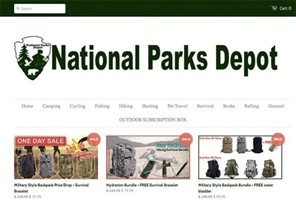
As Robert recounts in this case study, the odds appeared to be stacked against him.
He was an ex-felon, he lacked sales and marketing skills, and he was in dire financial straits.
However, something about being an ex-felon motivated him to be unique and stick out. That is how he came to create National Parks Depot, an eCommerce company that provides outdoor adventure goods and clothes.
What He Did To Succeed
Ads on Facebook
Starting with a minimal marketing spend of $60, he received a sales return of over $1,000. He subsequently doubled his ad budget and quadrupled his ROI. He gradually increased his marketing expenditure and reached $80,000 in sales.
Key Takeaway
Don’t be scared to invest money in product promotion. Even though he didn’t have much money, Robert was prepared to put it up to see if Facebook Ads would work for his company.
Yes, it did.
Invest money to increase sales, thus testing to discover whether paid advertising works for your company.
How I Imported Gaming Glasses With Alibaba and Made $2,416.51 In 5 Weeks

Another Shopify challenge that Shopify staff took on. In Example #8, we saw how they built a matcha green tea firm from the ground up in just three days. We saw in Example #13 how they started selling t-shirts online in LESS THAN A MONTH.
Another Shopify employee, Corey Ferreira, took up the challenge this time and opted to open an online eCommerce business offering blue-light filtering spectacles for gamers.
This time, the outcome was $2,416.51 in 5 weeks.
What He Did To Succeed
He, like the other men who took on challenges at Shopify, swiftly worked his way through different marketing channels.
Setting up affiliate commissions and enlisting influencers to help market his product created the highest revenue for him.
(Tip: Use ReferralCandy to boost your influencer marketing and increase word-of-mouth purchases.)
Key Takeaway
Are there individuals in your niche who have large audiences? Reach out to them and offer them an affiliate arrangement in exchange for promoting your product to their audience.
How One eCommerce Entrepreneur Explored New Sales Channels – And Took Revenues From $8K to $96K per Month

Eating healthy may be a pain.
Really.
We all know we should eat healthier, sleep more, and exercise more, but we don’t. Because we’re too preoccupied.
Then there’s Raw Generation.
Raw Generation is a start-up that makes it easier to consume raw, unpasteurized juice from fresh fruits and vegetables.
What He Did To Succeed
Websites that provide bargains.
Jessica, the creator, was referred to Lifebooker, a discount site, after initially marketing on social media and failing to get momentum.
They struck a home run after marketing on Lifebooker.
Most Raw Generation’s sales originate from discount websites such as Groupon, Gilt, and Rue La La. (Gilt and Rue La La are no longer used.)
Key Takeaway
Once you’ve discovered a marketing channel that works for you, don’t look for additional ones. Increase your bets and make it work for you again and again.
80/20 Validation: The Cheap And Fast Way To Prove A Business

What exactly is bone broth? It is, after all, a bone broth that has been hailed as a superfood by the paleo community.
What’s the issue?
It is not easily available over the internet.
At least, until Kettle & Fire arrived on the scene.
Kettle & Fire was the first firm to create a shelf-stable beef bone broth. This bone broth does not need to be frozen until it is opened.
What He Did To Succeed
By ensuring that the product was something that consumers wanted.
Yes, bone broth was becoming increasingly popular.
The main concern for entrepreneurs, however, is not one of popularity, but rather one of “would anybody put money down for this product?”
Justin and Nick ensured this by launching a landing page and bringing Bing traffic to it (classic Four Hour Work Week-style.) What was the ultimate result? A single trial like this resulted in $500 in sales, validating their whole business concept.
Key Takeaway
Never presume that your product will be well-received by the market. Always experiment to find out (be it through messaging people, sending paid traffic, etc.)
Adding credibility generates a 46% increase in conversion for mattress company
A mid-sized furniture manufacturer that sells organic latex mattresses collaborated with MECLABS Institute to improve total mattress purchasing (MECLABS is the parent organization of MarketingSherpa). It is one of just a handful GreenGuard Gold certified mattresses.
The team executed an A/B split test to evaluate which credibility method would result in the highest rate of mattress purchases.
The certification was acknowledged on the control landing page, although it was understated.
Creative Example #1: Organic latex mattress control landing page
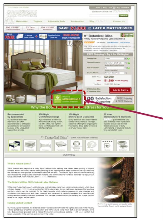
A section titled “What is the GreenGuard Gold Seal?” was added to the treatment landing page.
Sample #2: Organic latex mattress treatment landing page
In the A/B test, the treatment landing page increased conversion by 46 percent. The supplementary copy’s physical value aided the purchaser in deciding whether or not the mattress was worth purchasing.
Dunkin’ increases gift card sales 300% by quickly tapping into changing customer motivations
Customers’ perceptions of your products and services might shift over time. A good example is a COVID-19 epidemic. Most businesses would have disregarded shifting consumer incentives if they had just treated customers the same way they did before the outbreak. And shifting incentives have an impact on how potential buyers view your offer.
Dunkin’ Donuts is an example of a corporation that acted quickly to capitalize on new consumer motives. “When COVID-19 attacked, Americans wanted to aid and express their support for the frontline troops.” “Dunkin’ wanted to provide folks a means to do so even if they couldn’t leave their homes,” said Justin Unger, Director of Strategic Partnerships at Dunkin’.
The DunkinCoffeeBreak.com e-commerce site, which was created in only a few days, allowed users to express their gratitude by sending a virtual coffee break in the form of a Dunkin’ e-gift card. Dunkin’ gave $1 (up to $100,000) for each card purchased on this website to the Dunkin’ Joy in Childhood Foundation emergency funds, which are intended for non-profits assisting families affected by COVID-19.
“Since the site’s inception, Dunkin’ has utilized it for a variety of occasions that are important to individuals, such as Teacher Appreciation Week, National Nurses Week, and Mother’s Day,” Unger said.
The site is driving incremental digital gift card sales and has resulted in a 300 percent increase in gift card sales for certain events year over year.
“I believe e-commerce, particularly in the gift card area, is a key [to] unlocking development.” With the launch of DunkinCoffeeBreak.com, we noticed a significant increase in online gift card sales without any cannibalization of our existing online gift card program. “It enabled us to reach new customers and tap into the richness of information and targeting available in the internet world, something you just cannot do with traditional gift cards hung on pegs,” Unger explained.
“When social distancing was introduced, online and mobile buying increased…
Gift card sales made directly from a restaurant’s or merchant’s website since mid-March are up 92 percent from last year, according to Blackhawk Network’s partners’ sales statistics,” said Brett Narlinger, Head of Global Commerce, Blackhawk Network, Dunkin’s gift card program partner.
Home décor company generates $734.40 in sales from “penny campaigns”
“Throughout my e-commerce career, I have successfully developed what I term ‘penny campaigns’ across multiple Google Ad accounts for a wide range of different businesses,” stated Stellar Villa co-founder Patrick Connelly.
According to him, most firms focus their ad expenditure on a few items or services that account for the majority of the company’s income. The concept behind a penny campaign is to delve deeper into your product line and provide extremely low bids for adverts.
“Penny campaigns may work with text advertising as well as Google Product Shopping ads, though I favor Product ads,” Connelly added. Once the goods have been added to a campaign, simply set a very low bid. While this varies depending on the business, Connelly often sets bids between five and twenty cents and employs broad matches for a wider reach when targeting keywords.
For example, the wall art firm executed a Shopping campaign with Product Listing Ads) for its “Nursery Wall Art” series from May to July. With a daily budget of $100, the team established a maximum cost-per-click of $0.20. “We knew we wouldn’t spend anything near that, but I like to let Google know we’re prepared to pay for as many $0.20 or fewer clicks as they can offer us,” Connelly said.
The ad generated 354 hits at a cost of $60.18 over the course of three months. The advertisement produced $743.40 in sales.
“The penny marketing technique may be used on platforms other than Google Ads.” “It also works really well with Amazon Advertising,” Connelly added.
A vegan blog grows traffic to 50,000 monthly visits with a more diverse SEO outreach strategy
Thrive Cuisine has over 25,000 backlinks but had reached a plateau with around 30,000 monthly unique visitors.
The team was still creating links and releasing material on the same timetable as previously, and they were baffled as to why they weren’t getting increased traffic and conversions.
George Pitchkhadze, CMO of Thrive Cuisine, attempted something fresh. Instead, than focusing on increasing the number of backlinks, he determined that the site needed a wider range of backlinks. Pitchkhadze halted outreach attempts that were repeatedly targeting the same type of website and spent two months developing an entirely new link-building and outreach strategy. This time, the team concentrated on websites in related areas rather than the vegan blog’s own field. After spending two months producing more varied material to connect to, they began the outreach drive in May.
The revised outbound outreach, which targeted more diversified websites, raised the number of referring domains by more than 50%. As a consequence, traffic grew from about 30,000 to more than 50,000 monthly visits from unique users, and “traffic value” increased by more than $10,000.
“If you want to gain e-commerce traffic, focus on backlink diversity and quality rather than just number.” This will significantly enhance your outcomes. “Create new material on your own website whenever feasible to truly display your own skills across varied themes,” Pitchkhadze said.
Footwear store increases conversion 21.5% with clearer communication on the website
KURU Footwear prioritizes customer service and convenience by providing free shipping, free exchanges, and free returns. While this messaging did present in various locations on the footwear brand’s website, the team started a test examining four possibilities that put those value statements higher in the user experience.
Creative Sample #3: Control homepage for footwear brand
The best-performing solution included a black bar with basic white lettering at the top of practically all pages other than the checkout funnel. It resulted in a 21.5 percent increase in conversion.
Creative Sample #4: Top-performing treatment for footwear website

Other treatments that contained the customer service message but also included a message reassuring client that Kuru will be open and operational during COVID-19 did not fare as well. “We discovered that simplicity functioned best,” stated Kelly Stanze, Kuru’s Manager of Marketing and Communications.
Creative Sample #5: Lower-performing treatment for footwear website

“It might be tough to ensure that potential new customers understand how much we place on customer satisfaction. While the proof is in the shoes, we’re always looking for new methods to demonstrate how committed we are to our consumers as a company. “This was simply one stage in a never-ending process,” Stanze explained.
Facebook Live show quadruples online orders for gourmet deli and marketplace
Big Bottom Market, located in the heart of Sonoma Wine Country, is a gourmet deli and marketplace. In addition to its store presence, the team runs an Etsy Shop where they offer Big Bottom Market-branded items as well as the work of local artisans.
“We’ve been in the e-commerce game since 2016 when we were named one of Oprah’s Favorite Things and had to use the Amazon platform for national sales,” Big Bottom Market owner Michael Volpatt explained. “Amazon was a terrific partner at the time, from orders and shipping to returns and all in between.”
That changed when our sales volume decreased, so we analyzed the math and determined that Etsy would be a better partner as we scaled up our increasing product range with goods, we made or collaborated with someone else to make for us… My point here is that flexibility is essential at all stages of your e-commerce journey.”
Volpatt would be obliged to be adaptable once more. The county of Sonoma was shut down on March 18th owing to the COVID-19 epidemic, and the in-person retail market was shuttered. Ecommerce became a considerably more essential component of Big Bottom Market’s sales suddenly.
“As a chef and cookbook author, I wanted to continue connecting with our clients and developed Culinary In Place, a Facebook Live cooking program,” Volpatt explained.
Volpatt prepared and exhibited local wines for fans, as well as other items sold at the market, inviting viewers to purchase them online.
In addition, after each program, he provided the video replay on all of the show’s social media sites, as well as recipes and details about the cuisine he made and wine he drank on the show.
” I’d go live on Facebook and save the video stream.” “I’d then share a link to the video on my personal page, Instagram TV, and YouTube,” he explained.
Creative Sample #6: Facebook Live cooking show from gourmet deli and marketplace
In addition to growing social media followers and consumer interaction, the aim was to increase e-commerce sales to compensate for lost revenue from in-store foot traffic.
“In our Etsy business, we used to get three to five orders every month.” We had three to five orders per week in the first week of performing the program, and that quickly climbed to five to ten orders each week. Those figures may appear modest to some, but for a tiny business in a tourist town, they were excellent. “Our sales ended up covering our monthly fixed expenditures, which was really beneficial for a firm that relies on foot traffic,” Volpatt explained.
Retail company increases revenue 311% with website redesign
Due to technical, usability, and value communication challenges, the Barbecues Galore website had a poor conversion rate. When a product was added to other product categories, for example, the URL slug of the product itself changed. “This presented us with challenges that we needed to handle right away, since a product with continually changing URLs is not SEO friendly and would come with undesired 301 redirects and, in some cases, 404s,” explained Andres Aguero, Senior SEO Specialist at Barbecues Galore.
The redesigned website addressed those technological concerns while also doing a better job of communicating value to customers. On the former website, for example, the product listing page featured relatively few photographs and did not prominently highlight reviews.
Creative sample #7: Previous product listing page on retailer’s original website
“We discovered that when individuals make major purchases online, they want to feel comfortable and confident that their money is being effectively spent,” Aguero explained.
The team spent money to add more photographs to the product page and contacted prior customers from both the online and physical venues to get a product review.
Creative sample #8: Product listing page on retailer’s new website
Due to unanticipated circumstances, the team was forced to extend the website’s launch date to April 2020. “In the time, we were at the height of COVID-19, and all of our brick-and-mortar facilities had been shuttered.” “At the time, our main source of money was internet revenue,” Aguero explained.
The revamp was successful. Income climbed 311 percent from April to August 2020 compared to the same period the previous year, while revenue from organic traffic increased 172 percent. (While most of the rise is likely attributable to site enhancements, this writer wonders if increased demand for backyard items owing to COVID-19 lockdowns also had a factor in the revenue gain.)
“My recommendation to fellow marketers is to prioritize your website’s existing traffic before making any further expenditures.” Our PPC specialist was blowing money on a regular basis only to find terrible conversion rates. If your conversion rate is low, try to determine why. Examine your competition to see what they are doing. “Once you’ve done that, you can start investing in PPC or SEO,” Aguero recommended.
Female wellness product overcomes ad ban with SEO-focused content creation and attracts 9,248 organic visitors in latest month
While digital advertising platforms attempt to repair their reputation by excluding businesses and items deemed detrimental, other less sinister firms are also being identified.
Chiavaye, for example, sells an all-natural, vegan personal moisturizer. Kaylyn Easton founded the firm because she suffers from endometriosis.
The corporation was earning around $14,000 per month in income by advertising the product through sponsored advertisements. However, its ad account was terminated roughly two years ago due to “adult material.”
“Paid advertisements were a good tactic for us until they didn’t.” “We lost more than 90% of our monthly income the instant we were taken down,” explained Kaylyn Easton, CEO & Founder of Chiavaye.
At the time, organic Google traffic was only approximately 20 visits per month, with 98 percent of it coming from sponsored searches like “Chiavaye lube.”
The organization opted to follow an SEO-focused content development approach. “We wanted to develop a plan that would strengthen our brand over time so that even after we stopped investing, it would continue to bring in value.” Even if we stopped generating SEO content today, we’d continue to reap the advantages for years to come. In contrast, if we cut off a sponsored advertising approach, we instantly observe a significant negative impact,” Easton explained.
The primary goal of the material is not to promote the product, but rather to assist the target audience in overcoming critical pain points.
“We’ve been producing four pieces of SEO-focused material per month that target endometriosis-related inquiries.” Endometriosis diet grocery list, for example. We discovered that ladies suffering from endometriosis need any sort of knowledge that will assist them. And, if the information is reliable, they’ll believe that individual – and even buy their items,” stated Joey Randazzo, Founder, and CEO of Portland SEO Growth.
After 18 months of producing four pieces of content each month, the site increased from roughly 20 visits per month to 9,248 organic visitors in the most recent month.
Each piece of content has two CTAs (calls to action). The first step is to purchase the merchandise. The second CTA is for a free e-book, which generates 250 downloads each month — a good way to establish an email list.
Creative Sample #12: Email signup form for an e-book from a female wellness product company

“We learned that [competitors] have sales email campaigns, with every other email containing a 30% off coupon.” “[Chiavaye’s] is more focused on creating value than anything else,” Randazzo explained.
The team uncovered the most frequently asked endometriosis-related queries from the target audience, such as “is dairy good to consume with endo?” Easton provides simple, straightforward answers to these issues in writing and video. The email body answers the query succinctly, connecting to articles on the company’s website for further information.
“Determine your target audience and then generate material that brings value to their life.” We’ve learned that 95% of the information we publish should provide value to the reader. The last 5% should sell us as a solution. It fosters trust and encourages people to sign up for our free e-book, resulting in the creation of a highly valuable email list for us,” Easton explained.
CONCLUSION
These were the main points we learned while authoring e-commerce case studies for our blog. I’m confident you’ll find something useful in them for your online business, no matter how many staff you have or what sort of things you sell.
You may start using some of these methods today and putting them to the test.

